Nobody builds broken software on purpose. Yet across web, desktop, and mobile, people with disabilities run into the exact same walls every day: buttons that go silent, forms without names, focus rings stripped away by CSS, and interfaces that shatter the second you zoom in.
Accessibility isn’t an abstract compliance hurdle or a favor you do for a niche audience. One in four adults has a disability. When an interface only works with a mouse and perfect 20/20 vision, users don’t open polite support tickets to tell you what went wrong—they leave. From an engineering standpoint, catching an unlabelled button or a broken contrast pair during code review takes three minutes. Scrambling to patch it after an audit or a legal notice takes an entire sprint.
The good news? You do not need to master every screen reader on the market or memorize hundreds of pages of technical specs to build accessible software. Most real-world failures trace back to a handful of predictable patterns that anyone on the team can test in minutes using free, built-in tools already sitting on your computer.
I put together this hands-on testing checklist to take the guesswork out of verification. It covers the core barriers I see across web, Windows, macOS, iOS, and Android:
- Clear Pass/Fail Rules: Exactly what needs to happen to ensure your application works for keyboard users, screen reader users, switch access, and low-vision zoom.
- Side-by-Side Visual Examples: Concrete illustrations of what passing code looks like versus common pitfalls that break real workflows.
- Platform-Native Tools: Step-by-step guidance using free browser extensions, OS accessibility inspectors, and bookmarklets you can run right now.
- Practical Triage and Quality Gates: How to prioritize real blockers over cosmetic bugs, write defects developers can actually reproduce, and involve disabled users where it counts.
Work through the interactive checklist below throughout your entire coding process—from initial wireframes and local builds to pull request reviews and final release candidate passes. Unplug your mouse, turn on high contrast, scale your text, and verify that what you build works for everyone from day one.
Table of Contents
Visual Design and Layout Checks
- Color Contrast Ratios
- Color Used Alone
- Text Sizing, Crowding and Spacing
- White Space and Reflow
- Content That Breaks on Zoom (400 Percent)
Structure, Images and Form Fields Checks
- Missing Image Alternative Text
- Form Field Labels, Names and Error Descriptions
- Semantic Structure, Headings and Landmarks
Interaction, APIs and Controls Checks
- Complete Keyboard Operability (No Mouse Required)
- Missing or Invisible Focus Indicators
- Unrecognized Custom UI Elements (Name, Role, Value)
- Misapplied APIs and Toolkit Controls
- Media Without Captions or Audio Description
Extended Touch and Timing Checks
- Touch Targets and Pointer Gestures
- Motion, Animation and Auto-Playing Content
- Timeouts and Error Recovery
Remediation and Verification Strategy Checks
- What to Fix First (Triage Priority)
- Workflow Integration (Shift-Left)
- Defect Quality: Writing Accessibility Bugs
- Testing with Disabled Users
Part 1: Visual Design and Layout
Check 1: Color Contrast Ratios
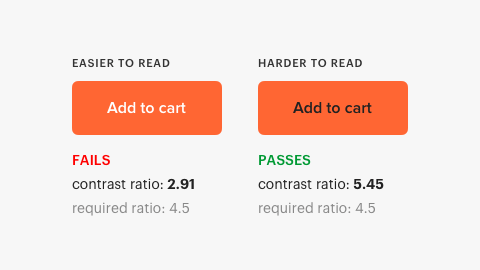
Color Contrast Compliance: Text and UI controls meet minimum contrast ratios against backgrounds.
Color Contrast Testing Standards
- Standards: Minimum 4.5:1 for body text; 3:1 for large text (18pt, or 14pt bold), icons, input borders, and focus rings. Test text placed over imagery, data charts, and disabled control states.
- Pass Rule: All live text and essential interactive UI components meet their required contrast threshold in default, dark, and system contrast modes.
Color Contrast Testing Tools
- Web Tools: axe DevTools, Chrome DevTools and Lighthouse, WAVE Browser Extension, TPGi Colour Contrast Analyser, and WebAIM Contrast Checker.
- Windows Desktop: Accessibility Insights for Windows, TPGi Colour Contrast Analyser, Windows Contrast Themes, PowerToys Color Picker (Windows Key + Shift + C), and Snipping Tool eyedropper.
- macOS Desktop: Xcode Accessibility Inspector, Digital Color Meter, and macOS Display Accessibility Settings (Increase Contrast / Reduce Transparency).
- Mobile (iOS/Android): Xcode Accessibility Inspector, Android Accessibility Scanner, Google Accessibility Test Framework, and Android High Contrast Text.
Check 2: Color Used Alone
Color Independence: Color is never the sole visual cue used to communicate information, errors, or state.
Color Independence Testing Standards
- Standards: Pair color indicators with text, distinct icons, or patterned styling. Body links require underlines or cues beyond color alone. Required inputs and error states must include adjacent text labels or icons, not red borders alone.
- Pass Rule: Every meaning, badge, chart legend, and validation message survives and remains clear without color perception.

Color Independence Testing Tools
- Web Tools: Chrome DevTools Rendering Emulate Vision Deficiencies, Sim Daltonism, and axe DevTools.
- Windows Desktop: Windows Settings Color Filters, Accessibility Insights for Windows, and Windows Narrator.
- macOS Desktop: macOS Display Color Filters, macOS Differentiate Without Color setting, and Sim Daltonism.
- Mobile (iOS/Android): iOS Color Filters, Android Color Correction, and Android Accessibility Scanner.
Check 3: Text Sizing, Crowding and Spacing
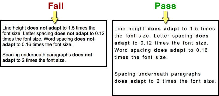
Typography Scaling: Text scales gracefully to 200% and accommodates custom spacing overrides.
Typography Scaling Testing Standards
- Standards: Body text minimum 16px baseline with generous line height; avoid fixed units (use rem/em) so text scales with OS/browser preferences; never use images of text. Layouts must survive WCAG text spacing: line height 1.5, paragraph spacing 2x, letter spacing 0.12, word spacing 0.16.
- Pass Rule: Text enlarges without clipping, overlapping, collision, or unreadable truncation across all viewports.
Typography Scaling Testing Tools
- Web Tools: Browser zoom and text-only zoom to 200%, Chrome DevTools Device Mode, Stylus User Stylesheets, and Text Spacing Bookmarklet.
- Windows Desktop: Windows Settings Text Size and Display Scaling, Accessibility Insights for Windows, and Windows Magnifier.
- macOS Desktop: macOS Larger Text Display Settings, Xcode Accessibility Inspector, and Apple Dynamic Type HIG.
- Mobile (iOS/Android): iOS Larger Accessibility Sizes, Android Font and Display Size, and Android Accessibility Scanner.
Check 4: White Space and Reflow
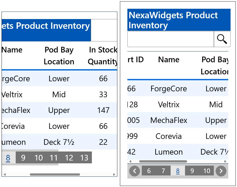
Layout Reflow: Controls have sufficient separation, and layouts adapt cleanly when compressed.
Layout Reflow Testing Standards
- Standards: Maintain comfortable margins and padding between clickable controls so adjacent items are not accidentally activated. Layouts must reflow into a clean single column when container space narrows.
- Pass Rule: No content overlaps, clips, or forces horizontal scrolling when panels or viewports shrink.
Layout Reflow Testing Tools
- Web Tools: Chrome DevTools Responsive Mode, Text Spacing Bookmarklet, axe DevTools Reflow Rules, and WAVE Extension.
- Windows Desktop: Window snap, 200% display scaling, and Accessibility Insights for Windows.
- macOS Desktop: macOS Split View, Xcode Accessibility Inspector, and SwiftUI Preview Variants.
- Mobile (iOS/Android): iOS Simulator, Android Display Size Split-Screen, and Android Accessibility Scanner Touch Target Audit.
Check 5: Content That Breaks on Zoom (400 Percent)
Deep Zoom Operability: Content and functionality remain fully intact at 400% zoom without horizontal scrolling.
Deep Zoom Testing Standards
- Standards: The interface must reflow at 400% zoom (equivalent to 320px CSS width) without horizontal scrolling (except data tables, maps, and diagrams). Dialogs and critical controls must not be pushed off screen.
- Pass Rule: All features, text blocks, and modal alerts remain completely accessible without two-dimensional panning.
Deep Zoom Testing Tools
- Web Tools: Browser zoom to 400%, Firefox Responsive Design Mode, Chrome DevTools Device Toolbar, and axe DevTools Reflow Rules.
- Windows Desktop: Windows Magnifier, Accessibility Insights for Windows, and Inspect (Windows SDK).
- macOS Desktop: macOS Screen Zoom, Xcode Accessibility Inspector, and SwiftUI Dynamic Type Previews.
- Mobile (iOS/Android): iOS Screen Zoom, Android Magnification, and Android Accessibility Scanner.
Part 2: Structure, Images and Form Fields
Check 6: Missing Image Alternative Text
Alternative Text Equivalents: Informative images feature meaningful alt text; decorative art is hidden.
Image Alternative Text Testing Standards
- Standards: Meaningful images need concise alt text; complex charts need an extended narrative text description; functional icons describe the resulting action (Search, not Magnifying glass). Omit redundant phrases like image of. AI-generated alt text is a first draft and must be reviewed in context. Decorative images must be hidden from assistive technology (empty alt attribute in HTML, isAccessibilityElement set to false on iOS, importantForAccessibility set to no on Android).
- Pass Rule: Every image conveys its true communicative purpose or is silenced completely from assistive technologies.
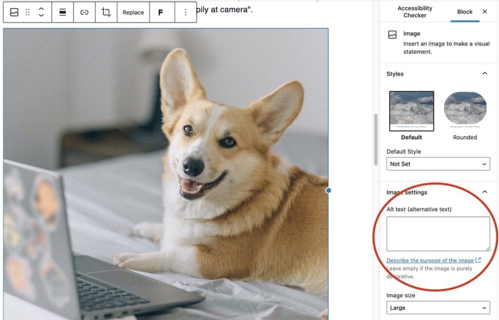
Image Alternative Text Testing Tools
- Web Tools: W3C WAI Easy Checks Image Alt Bookmarklet, axe DevTools, WAVE Extension, and Firefox Accessibility Inspector.
- Windows Desktop: Inspect (Windows SDK) Name Property and Accessibility Insights for Windows.
- macOS Desktop: Xcode Accessibility Inspector Audit and Interface Builder Accessibility Panel.
- Mobile (iOS/Android): Xcode Accessibility Inspector (iOS), Android Accessibility Scanner, and Google Accessibility Test Framework in CI.
Check 7: Form Field Labels, Descriptions and Errors
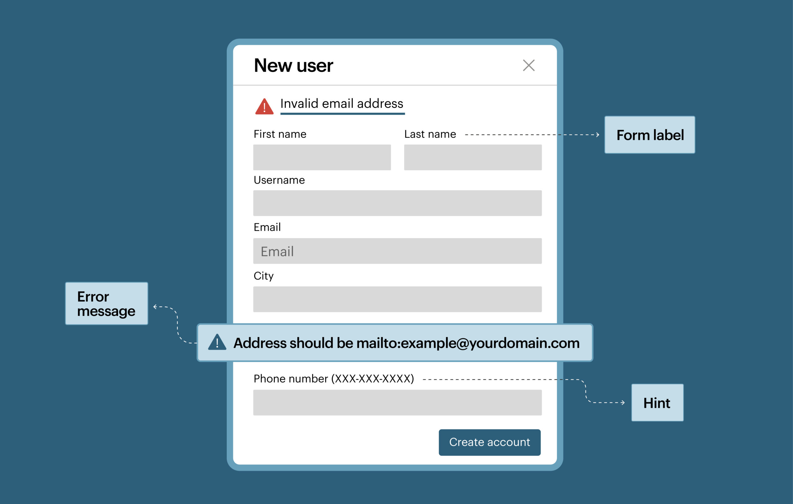
Form Control Accessibility: Inputs provide programmatic labels matching visible text, fieldset groupings, and linked errors.
Form Control Testing Standards
- Standards: Every input needs a persistent programmatic label—placeholder text is never a label. Visible labels must match the accessible name so voice control users can activate them by name. Grouped controls (radio sets, checkboxes) require a shared group legend. Errors must sit adjacent to the field and link programmatically as an accessible description (aria-describedby). Mark required fields in text, not color alone, and provide autocomplete attributes for personal data (name, email, address).
- Pass Rule: Every input announces its label name, purpose, state, and specific error messages when invalid.
Form Control Testing Tools
- Web Tools: W3C WAI Form Field Labels Bookmarklet, axe DevTools Form Rules, WAVE Extension, and Browser Accessibility Inspector.
- Windows Desktop: Accessibility Insights for Windows (verify Name, ControlType, IsRequired, and IsInvalid), Inspect (Windows SDK), and AccEvent Watcher.
- macOS Desktop: Xcode Accessibility Inspector and AppKit/SwiftUI Accessibility Labels.
- Mobile (iOS/Android): Xcode Accessibility Inspector, Android Accessibility Scanner, and Espresso / XCUITest Accessibility Audits.
Check 8: Semantic Structure, Headings and Landmarks
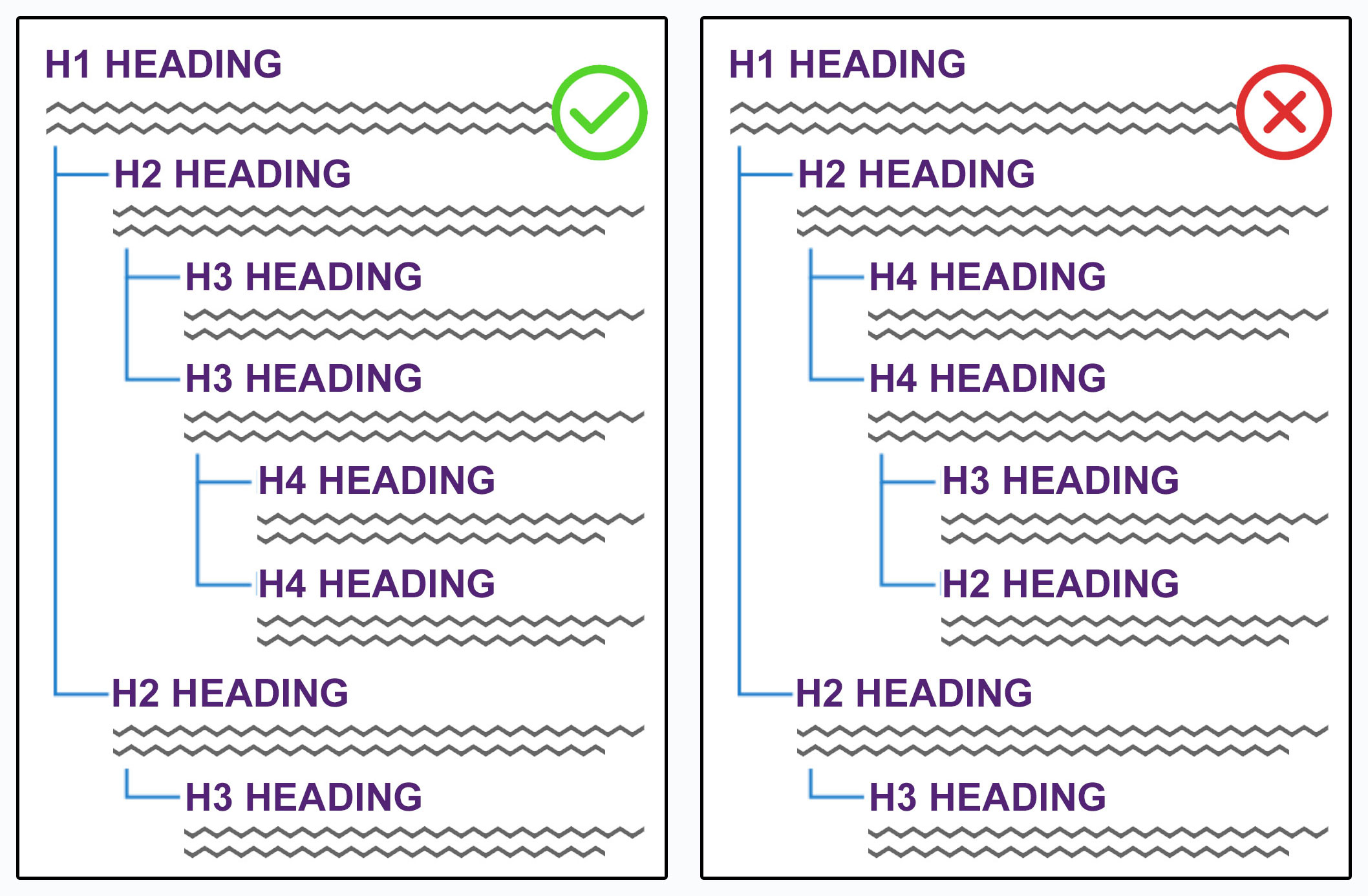
Document Structure: Content uses real headings, logical hierarchy, true lists, data tables, and landmark regions.
Structural Semantics Testing Standards
- Standards: Only one h1 tag per page; headings descend in strict order without skipped levels (h1 to h2 to h3); never use plain bold text as a faux heading. Group items with semantic list elements. Use true table header cells with scope attributes. Enclose major page areas in landmark containers (main, nav, header, footer, aside). Every page view needs an informative title.
- Pass Rule: The structural tree alone explains the layout and provides a complete navigation outline for screen readers.
Structural Semantics Testing Tools
- Web Tools: W3C WAI Headings Bookmarklet, Paul J. Adam Headings Bookmarklet, axe DevTools, and WAVE Structure View.
- Windows Desktop: Accessibility Insights for Windows and Inspect (Windows SDK) UIA Tree.
- macOS Desktop: Xcode Accessibility Inspector and Apple Accessibility Container APIs.
- Mobile (iOS/Android): Android Accessibility Scanner and Xcode Accessibility Inspector.
Part 3: Interaction, APIs and Controls
Check 9: Complete Keyboard Operability
Keyboard Operability: Every interactive control is reachable and operable using only a keyboard.
Keyboard Operability Testing Standards
- Why It Matters: Unplug the mouse. Switches, sip-and-puff hardware, voice control, head trackers, and screen readers all depend on the keyboard navigation interface.
- Web Navigation: Tab forwards and Shift+Tab backwards through all controls; activate links with Enter; toggle buttons, checkboxes, and radio buttons with Space or Arrows; navigate dropdown menus with Arrow keys; dismiss overlays with Escape.
- Pass Rule: Zero keyboard traps exist; no feature requires mouse-only interaction or hover gestures.
Keyboard Operability Testing Tools
- Web Tools: W3C Preliminary Keyboard Interaction Guidance, axe DevTools Focus Rules, and Chrome DevTools Focus Tracking.
- Windows Desktop: Accessibility Insights Tab Stop Visualizer and Inspect (Windows SDK).
- macOS Desktop: macOS Full Keyboard Access and Xcode Accessibility Inspector. (Ensure macOS System Settings Keyboard Keyboard navigation is enabled; Safari Settings Advanced Press Tab to highlight each item on a webpage).
- Mobile Devices: Connect an external Bluetooth keyboard; review iOS Full Keyboard Access and Android Keyboard and Switch Access.
Check 10: Missing or Invisible Focus Indicators
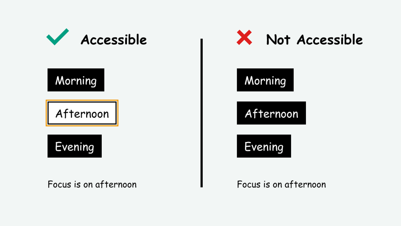
Focus Management: Focus rings are clearly visible (3:1 contrast) and managed inside dialogs and modals.
Focus Management Testing Standards
- Focus Indicators: Every interactive component must show an obvious focus style (minimum 3:1 contrast against adjacent colors). Never suppress default outlines with outline none without replacing them with an enhanced focus ring.
- Modals and Overlays: Opening a modal moves focus inside it immediately; focus loops strictly inside the dialog until closed; background content is marked inert; Escape closes the dialog; focus returns to the opening trigger upon dismissal.
- Pass Rule: Keyboard users can spot the active control at all times, with no focus rings disappearing off-screen or hiding behind sticky headers.
Focus Management Testing Tools
- Web Tools: MDN CSS :focus-visible, Chrome DevTools Emulate Focused Page, and axe DevTools Focus Rules.
- Desktop Tools: Accessibility Insights for Windows Tab Stop Visualizer, Windows Contrast Themes, Inspect (Windows SDK), and macOS Full Keyboard Access.
- Mobile Tools: Apple Full Keyboard Access Highlight, Android D-pad and Directional Navigation Principles, and Android Accessibility Scanner.
Check 11: Unrecognized Custom UI Elements
Custom Element Exposure: Custom widgets expose an accessible name, role, value, and dynamic state changes.
Custom Element Testing Standards
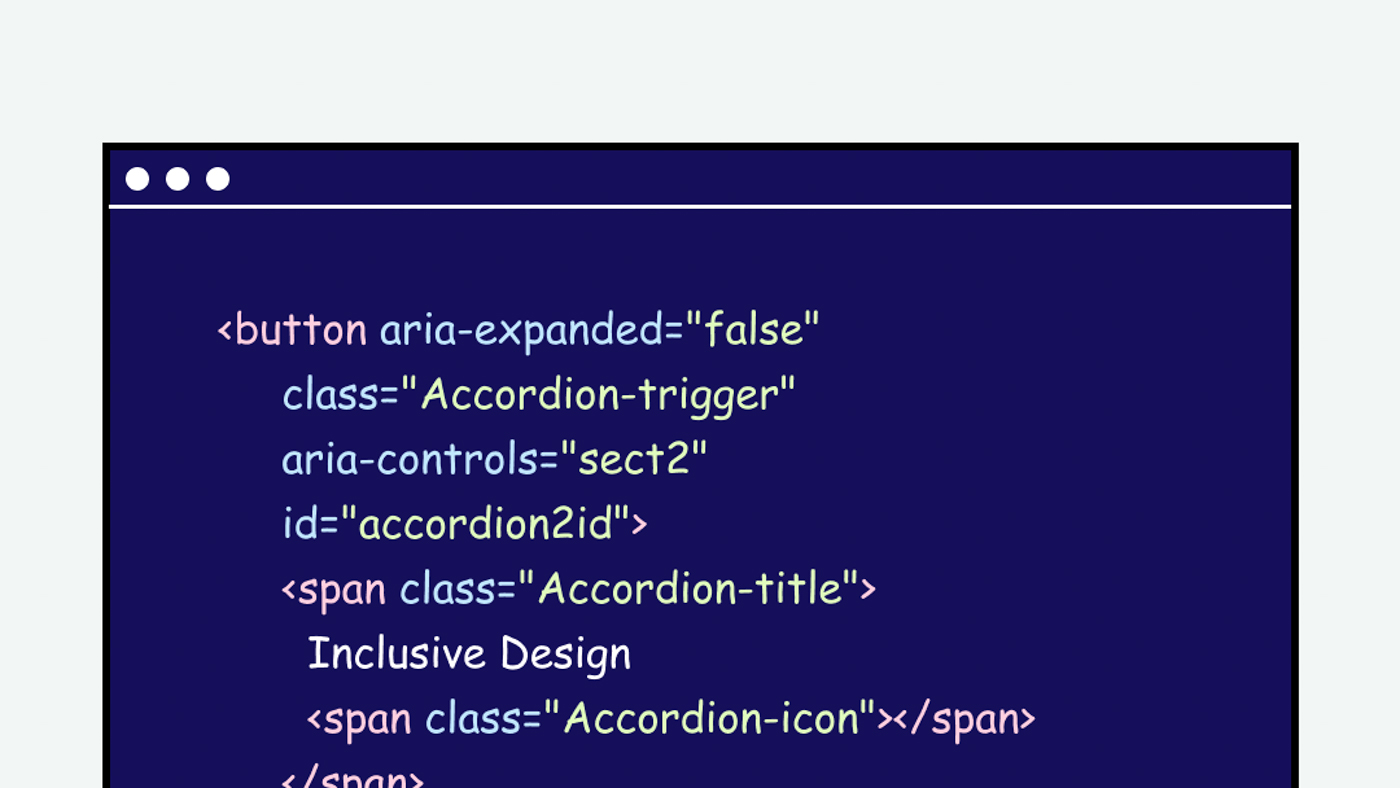
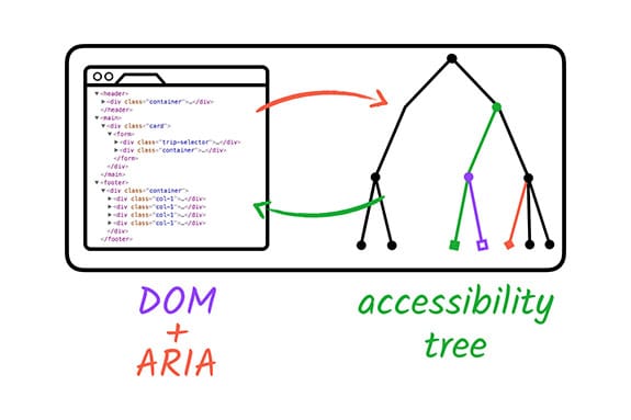
- Standards: Prefer native platform controls first (button, select, input). Custom widgets (tab strips, accordions, trees, custom switches) must expose their accessible role, name, and live states (aria-expanded, aria-selected, aria-checked) via accessibility APIs. State changes must update the accessibility tree immediately.
- Pass Rule: Every custom component behaves identically to a native operating system control when evaluated by assistive tools.
Custom Element Testing Tools
- Web Tools: Browser Accessibility Tree Inspector, W3C ARIA Authoring Practices Guide (APG), Paul J. Adam ARIA Bookmarklet, and axe DevTools ARIA Rules.
- Windows Desktop: Inspect (Windows SDK) verifying Name, ControlType, and Value; AccEvent Watcher; and Accessibility Insights for Windows.
- macOS Desktop: Xcode Accessibility Inspector and Apple NSAccessibility Protocol.
- Mobile (iOS/Android): Xcode Accessibility Inspector, Android Accessibility Scanner, and Google Accessibility Test Framework.
Check 12: Misapplied APIs and Toolkit Controls
API Architecture: Accessibility APIs are applied correctly without conflicting roles or exposed hidden content.
API Architecture Testing Standards
- Why It Matters: Wrong ARIA or bad API usage is worse than no accessibility markup. Native buttons already carry semantic roles; adding custom roles can wipe out default functionality. Redundant attributes cause assistive technology to announce conflicting labels.
- Off-Screen and Hidden Content: Content hidden visually (display none, visibility hidden, or inert) must be excluded from accessibility trees so users do not focus on invisible ghost controls.
- Canvas, Game Engines and UI Toolkits: Frameworks (Flutter, React Native, Unity, custom canvas renderers) draw custom pixels and expose nothing by default. You must explicitly map controls to UI Automation (Windows), NSAccessibility (macOS), or platform accessibility bridges.
- Pass Rule: Native semantics are preserved, custom roles mirror real component behavior, off-screen content is silent, and framework widgets expose full accessibility trees.
API Architecture Testing Tools
- Web Tools: axe DevTools ARIA Rules and WAVE ARIA Alerts.
- Windows Desktop: Inspect (Windows SDK) and Accessibility Insights for Windows.
- macOS Desktop: Xcode Accessibility Inspector and Apple NSAccessibility Documentation.
- Mobile (iOS/Android): Xcode Accessibility Inspector and Android Accessibility Scanner.
Check 13: Media Without Captions or Audio Description
Multimedia Accessibility: Video has synchronized captions and audio descriptions; media player controls are accessible.
Multimedia Testing Standards
- Standards: Synchronized closed captions for all prerecorded videos with spoken audio and meaningful sounds; full descriptive text transcripts for audio-only podcasts; audio descriptions for visual action, charts, or text shown on screen.
- Accessible Media Players: Avoid rolling custom media players without accessibility hooks. Use proven accessible players like Able Player (open source HTML5 player supporting captions, interactive transcripts, chapters, and audio description tracks).
- Pass Rule: Media is usable by people who cannot hear audio or see video, with all player controls operable without a mouse.
Multimedia Testing Tools
- Web Tools: W3C Caption Guidance, WebVTT Caption Validator, axe DevTools Media Rules, and W3C Transcripts Guidance.
- Windows Desktop: Windows Live Captions and Accessibility Insights for Windows.
- macOS Desktop: macOS Live Captions and developer.apple.com/documentation/avfoundation.
- Mobile (iOS/Android): iOS Closed Captions and SDH, Android Caption Preferences, and Android Live Caption.
Part 4: Extended Touch and Timing Checks
Check 14: Touch Targets and Pointer Gestures
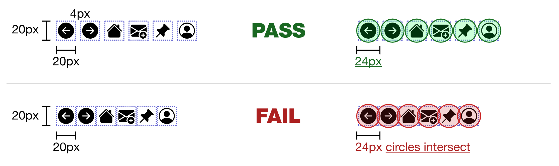
Touch and Pointer Design: Tappable targets are at least 24×24 px (best practice 44×44 / 48×48) with single-tap alternatives.
Touch and Pointer Testing Standards
- Target Sizing: WCAG 2.2 Target Size Minimum requires at least 24×24 CSS pixels. Platform design guidelines recommend larger: Apple Human Interface Guidelines specify 44×44 pt; Google Material Design Guidelines specify 48×48 dp. Check with your design system. Targets must include enough spacing to avoid accidental activation.
- Pointer Gestures: Any action executed via drag, swipe, pinch, two-finger gesture, or path-based shape tracing must offer a simple single-pointer alternative (such as standard Plus and Minus zoom buttons alongside pinch-to-zoom).
- Pointer Cancellation: Primary actions must trigger on touch release/up-event (not on mouse down / touch press), allowing users to slide away from a control to cancel accidental taps.
- Pass Rule: Controls are easy to hit without mis-taps, gesture alternatives exist, and gestures can be aborted safely.
Touch and Pointer Testing Tools
- Testing Techniques: Test using single finger, stylus, and external keyboard.
- Mobile Scanners: Android Accessibility Scanner touch target audit and Xcode Accessibility Inspector.
Check 15: Motion, Animation and Auto-Playing Content
Motion and Vestibular Safety: No flashing over 3 Hz, autoplaying media can be paused, and prefers-reduced-motion is respected.
Motion and Vestibular Testing Standards
- Flashing and Seizures: No content flashes, strobes, or flickers more than three times in any one-second interval (WCAG Three Flashes Threshold).
- Pause, Stop, Hide: Any content that moves, scrolls, auto-advances (carousels, tickers), or auto-updates for longer than 5 seconds must include a visible, keyboard-operable pause button.
- Auto-Playing Audio: Never auto-play audio or video with sound. Audio lasting more than 3 seconds must have an immediate mute/stop control independent of system volume.
- Reduced Motion Support: Honor the operating system reduced motion setting (MDN CSS prefers-reduced-motion; Reduce Motion in iOS/macOS; Remove animations in Windows/Android) by disabling parallax scrolling, large zooms, and decorative transitions.
- Pass Rule: The interface respects vestibular safety, contains zero seizure triggers, and provides pause controls for moving elements.
Motion and Vestibular Testing Tools
- Web Tools: MDN CSS prefers-reduced-motion and Chrome DevTools Rendering Emulate CSS media feature prefers-reduced-motion.
- Operating System Settings: Windows Settings Accessibility Visual Effects (Animation effects toggle); macOS System Settings Accessibility Display (Reduce motion); iOS Settings Accessibility Motion (Reduce Motion); Android Settings Accessibility (Remove animations).
Check 16: Timeouts and Error Recovery
Timeouts and Recovery: Session time limits are extendable, input data is preserved, and transactions can be reversed.
Session Timing and Recovery Testing Standards
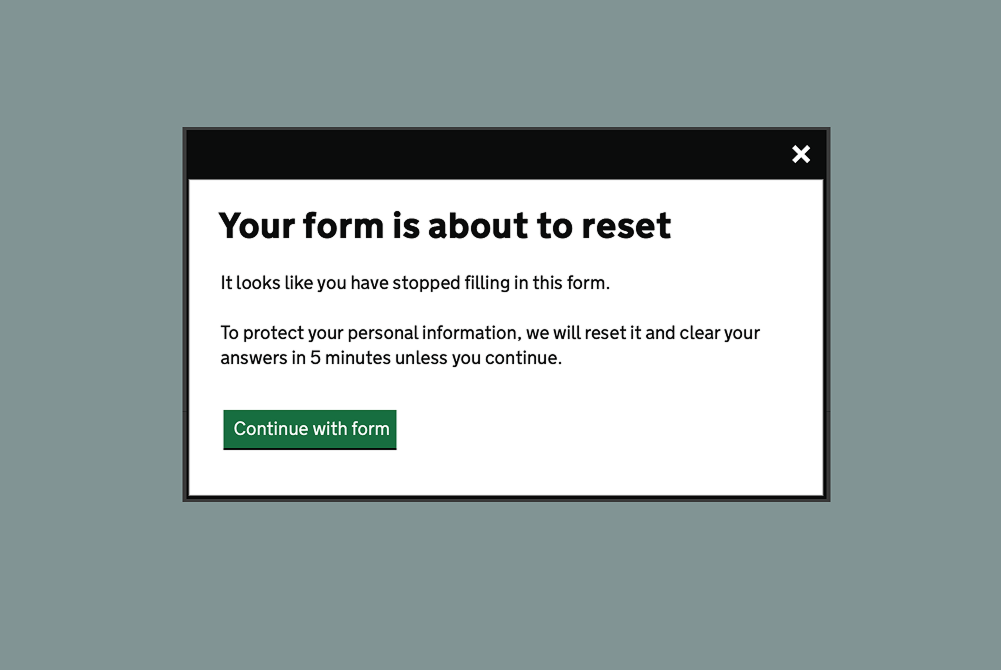
- Time Limit Warnings: Warn users at least 20 seconds before an inactivity timeout or session expiration occurs, providing a simple single-action control (such as Space or Enter keypress) to extend the time limit by at least 10 times (WCAG Timing Adjustable).
- Preserve User Data: When an inevitable timeout occurs, do not wipe user inputs. Retain form data so the user can authenticate and resume where they left off.
- Actionable Error Messages: Validation errors must explain specifically which field is wrong, why it failed, and provide precise corrective instructions in text located directly next to the input (WCAG Error Suggestion).
- Legal and Financial Reversibility: For actions causing legal commitments, financial transactions, or user data modification, provide an opportunity to review and confirm inputs or reverse/cancel the transaction before final submission (WCAG Error Prevention).
- Pass Rule: Users encounter no unexpected session lockouts, lost data, or unrecoverable form errors.
Session Timing and Recovery Testing Tools
- Manual Verification: Inactivity timer testing, network session timeout simulations, and form re-authentication audits.
Part 5: Remediation and Verification Strategy
Check 17: What to Fix First (Triage Priority)
Remediation Prioritization: Remediation prioritizes complete task blockers and shared UI component patterns first.
Remediation Prioritization Standards
- Blockers First: Critical barriers preventing task completion (such as keyboard traps, controls unreachable without a mouse, unlabeled form fields blocking submission).
- High-Impact Global Issues: Structural defects affecting every screen (such as broken heading hierarchy, missing skip navigation links, global contrast failures in navigation bars).
- Localized and Cosmetic Defects: Single-page or non-blocking issues (such as an individual low-contrast footer link or missing alt attribute on a minor thumbnail).
- Fix Patterns, Not One-Offs: Resolve issues within shared components, design system tokens, or page templates to fix dozens of defects in a single update.
Remediation Prioritization Tools
- Triage Frameworks: Issue ticketing matrices, blocker impact severity tagging, and component repository audits.
Check 18: Workflow Integration (Shift-Left)
Shift-Left Verification: Accessibility verification is integrated across design, development, pull requests, and CI/CD.
Shift-Left Workflow Standards
- Design Phase: Review color contrast ratios, font hierarchy, and intended focus order in Figma or design mockups before writing code.
- Build Phase: Use native HTML/OS elements first; include accessibility acceptance criteria in the Definition of Done.
- Pull Request Review: Require keyboard walkthroughs and programmatic label verifications on every PR checklist.
- Continuous Integration (CI): Run automated accessibility linters and axe/scanner passes on every build to prevent regressions.
- Release Phase: Test specific user flows modified in the release rather than delaying launches for manual re-audits.
Shift-Left Workflow Tools
- Linters and CI Scanners: axe-core CLI, axe Linter, ESLint plugin jsx-a11y, and Espresso / XCUITest CI Audits.
Check 19: Defect Quality: Writing Accessibility Bugs
Defect Ticket Quality: Defect tickets include user impact, precise steps, environment, tool output, and expected behavior.
Defect Ticket Standards
- User Impact First: Clearly explain who is blocked and what task cannot be completed (such as Screen reader users cannot select a delivery date).
- Steps to Reproduce: Provide step-by-step instructions naming the exact screen, view, and UI element.
- Environment Details: Document OS version, browser version, assistive technology used, and testing tool names.
- Technical Evidence: Paste inspector values, name/role tree dumps, and contrast ratios; attach screenshots.
- Expected Behavior and Standard: State what should happen and cite the relevant WCAG criterion, such as WCAG 2.2 SC 2.1.1 Keyboard.
- Severity Rating: Set severity based on functional task blockage, not visual aesthetics.
Defect Ticket Tracking Tools
- Issue Trackers: Jira, GitHub Issues, or Azure DevOps bug report templates configured with mandatory impact and assistive technology environment fields.
Check 20: Testing with Disabled Users
User Co-Creation: Manual tool audits are validated through paid testing sessions with people with disabilities.
Disabled User Testing Standards
- Automation Catches Approximately 30 Percent: Automated testing engines catch roughly one-third of accessibility defects—the rest require manual and experiential testing.
- Real Assistive Technology Users: People who use screen readers, magnifiers, voice control, or switches on a daily basis catch workflow barriers that developers miss.
- Fair Compensation: Always pay participants for user testing sessions and usability feedback.
- Early Engagement: Bring disabled participants in during early wireframing and prototyping while changes remain cost-effective.
- Inclusive Teams: Employing people with disabilities on engineering and design teams incorporates lived experience from day one.
User Testing Engagement Tools
- Participant Protocols: Usability test task scripts, screen-recording and remote observation platforms (such as Zoom or Lookback), and assistive tech test matrices.
Share Your Feedback and Next Steps
Accessibility testing isn’t static—as frameworks shift and UI patterns evolve, the ways we verify them need to keep pace. Take this checklist for a spin across your current build, and drop a comment below with your feedback: what worked well for your team, where did you run into edge cases, and what tools or scenarios would you like me to break down next?

Leave a Reply